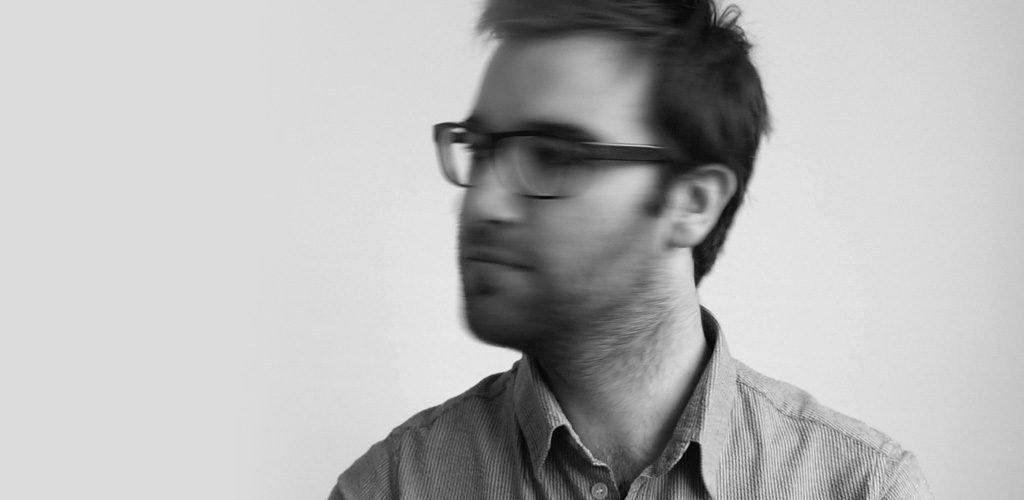
For Geoffrey Brusatto graphic design is not some kind of job, but a way of living. His interest in design grew since my childhood when he was spending his days in the library in search of (design) books to feed his never-ending curiosity and attraction to all considered beautiful and aesthetic.
Please briefly describe the creative process behind one of your submitted works.
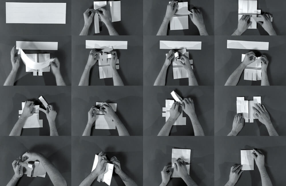
The hand-woven agenda 6’34 started with the idea to create something really classy and chic by using paper as the unique basic material. The inspiration came from a wicker leather agenda and I started experimenting to achieve the same effect. I folded over and over again, paying attention to the smallest details due to the fragility of the material, and playing with different folding techniques. It was just when I wanted to give up, that I managed to get the result I wanted. The fruit of my persistence in obtaining that single perfect concept and product is what gives me so much satisfaction in doing my work. Never giving up and always staying critical in the creative process is the main lesson I learned.
How would you describe your work style to people who first come across it?
Minimal classic with an edge.
Is there anything intrinsically Belgian that you think has been a strong influence or inspiration in what you do?
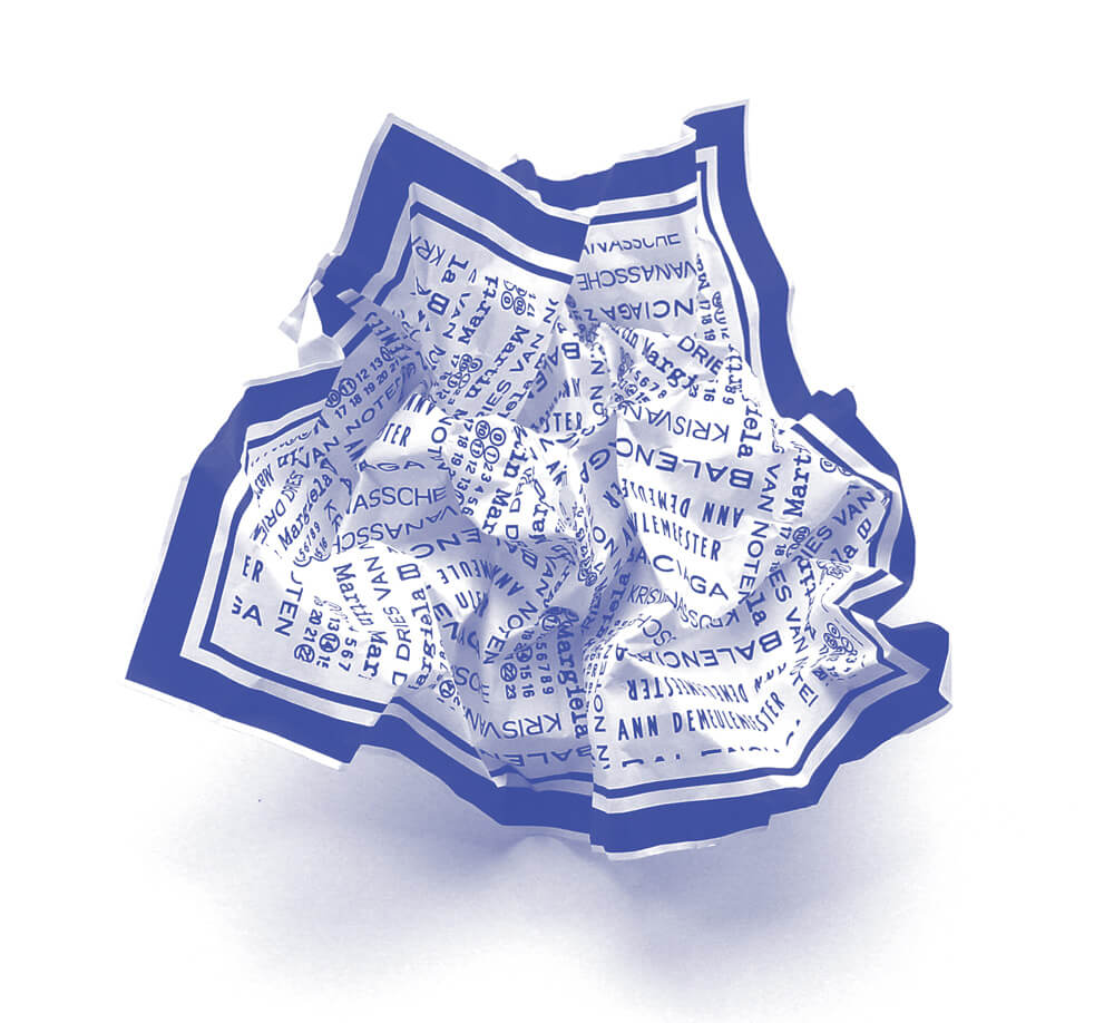
I have a strong connection with (Belgian) fashion and architecture/product design in general. In my design, I try to obtain a tactile character where possible. I love to play with texture and the third dimension.
Do you see any particular trends emerging in Belgian design? What do you think the future will bring for design in Belgium?
For me Belgian design has a raw side, something dark and melancholic, but not in a negative way. You will find it in Belgian fashion, architecture, music and even the movie industry. Some kind of understated coolness. I do not know how to describe it, but there must be something in the air…
I do not know exactly what the future will bring but hopefully more of that
From your personal perspective, how do you keep the balance between experimental and commercial aspects in your works?
I try to put as many experimental elements in my designs as possible, but this is not always possible. Sometimes the problem is technical (which is mostly related to budget) or sometimes it is client related. However, as a creative person, your challenge is to make it work, even if the client has a (totally) different perception.
For me personally, the best way to keep the balance is my free work. I design personal projects just to challenge myself.
How important is experimenting with design to you? Or do you just follow current trends?
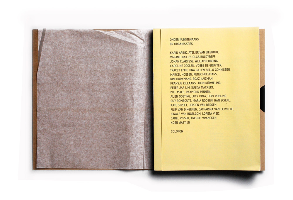
For me, designing is a continuous experiment. I like to play with textures and forms in order to break away from the classic typography. As creation is the best experiment of all, I try to innovate and create my own graphic world.
You have a minimalist style, is this reflected in your character?
I see myself as a really structured person, but everybody around me says it is the opposite. Designing helps me to focus. Starting from a multitude of elements I manage to make an abstraction of the ballast, finishing with a minimalist concept.
Do you believe that Belgium provides good resources for design? Is it easy for new designers to promote themselves?
Belgium is not really known for its graphic scene, but (graphic) design is more exposed nowadays. As design receives more attention and people are more aware of what it represents, I think from that point of view it is easier for new designers to promote themselves.
What is your favourite colour and why?
Although technically black is not a colour, I really love its different shades.
Can you say that Belgium has a creative client base?
There is certainly room for creativity in Belgium. It is a small country but has a really good design atmosphere.
What you will be doing around the same time next year?
Hopefully something fun!

