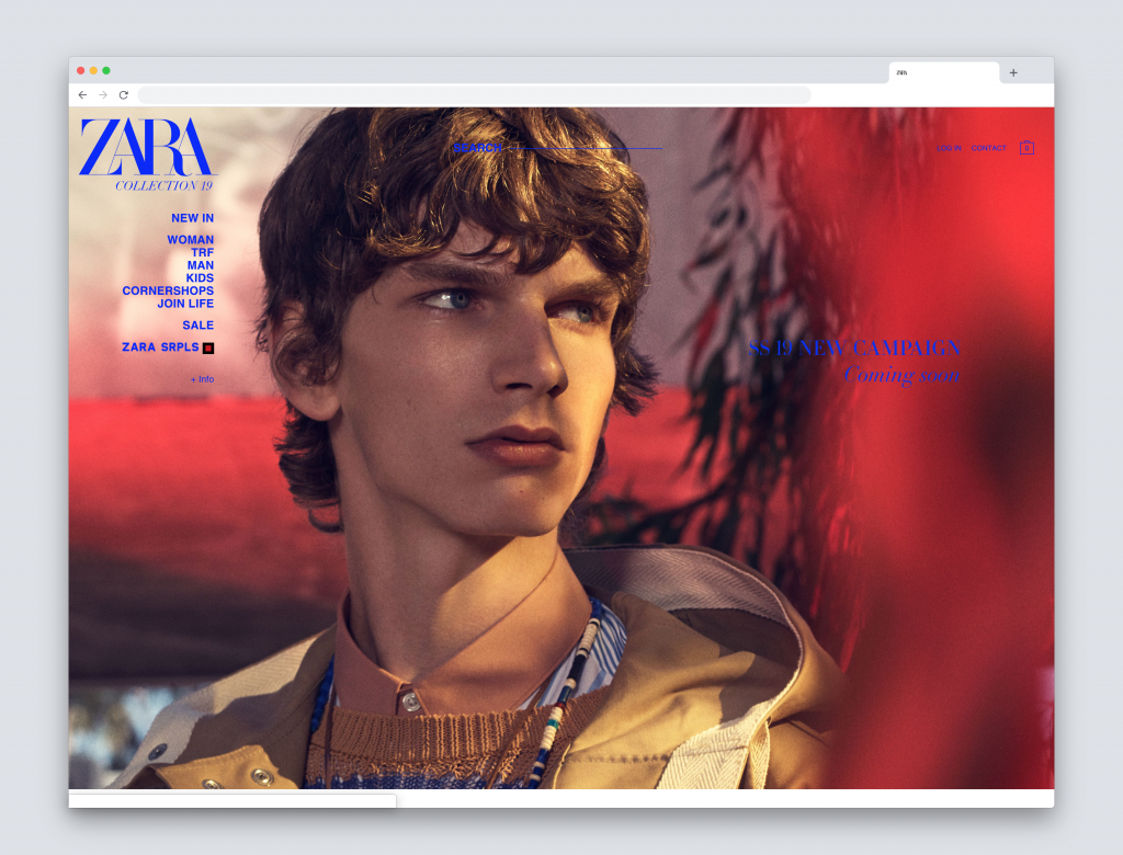
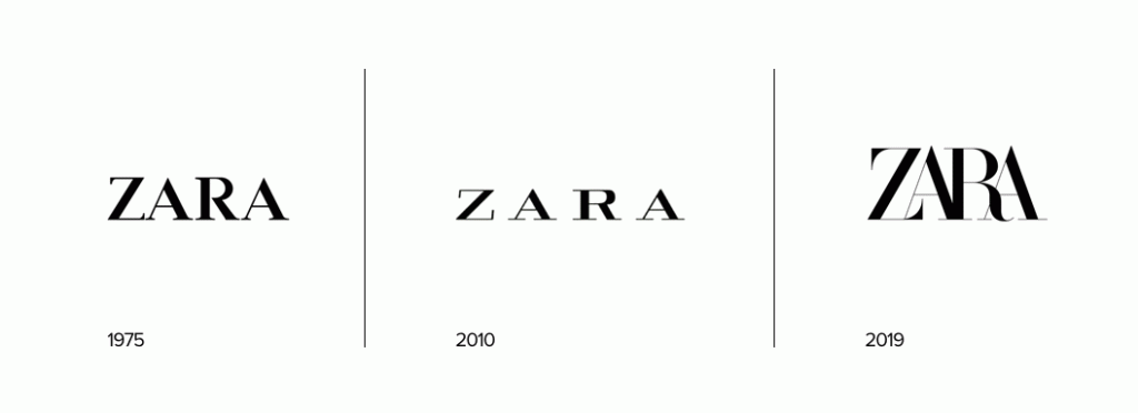
The 44-year Spanish old fast fashion retailer Zara introduced a new logo very recently (designed by Baron & Baron) and like every big logo redesign you have people screaming murder without being constructive in their criticism. It’s easy to do so, so let’s try to discuss this new logo.
The bad
You can see the potential problems with the logo, the extreme tight kerning makes it harder to read and there is no need to tell you that those problems will only get bigger when they use a small version of the logo, not to think of the labels inside the clothes.

![]()
The good
The previous redesign was done in 2010. 9 Years is quite a long time in the fashion retail business which is very sensitive to trends and keeps on changing at a fast pace. So I can see why a redesign was needed. Compared to the old logo the new one has much more character and in my opinion that’s a good thing. They break the trend to minimize logo design for fashion brands like the recent ‘Burberry’ logo redesign. It looks fresh, less classic and younger than the old one, better suited to their audience. Let’s see how we feel about the new Zara logo in 6 months.
What’s your opinion?


