In this episode, I ask Tessa Persoons and Lauwri De Pater of design studio LOBSTER a couple of questions. Tessa and Lauwri met at Famous, an advertising agency in Brussels where they found their mutual connection in design and humor.
Episode 4 of Shorts is available on
YouTube Spotify Apple Podcasts Google Podcasts
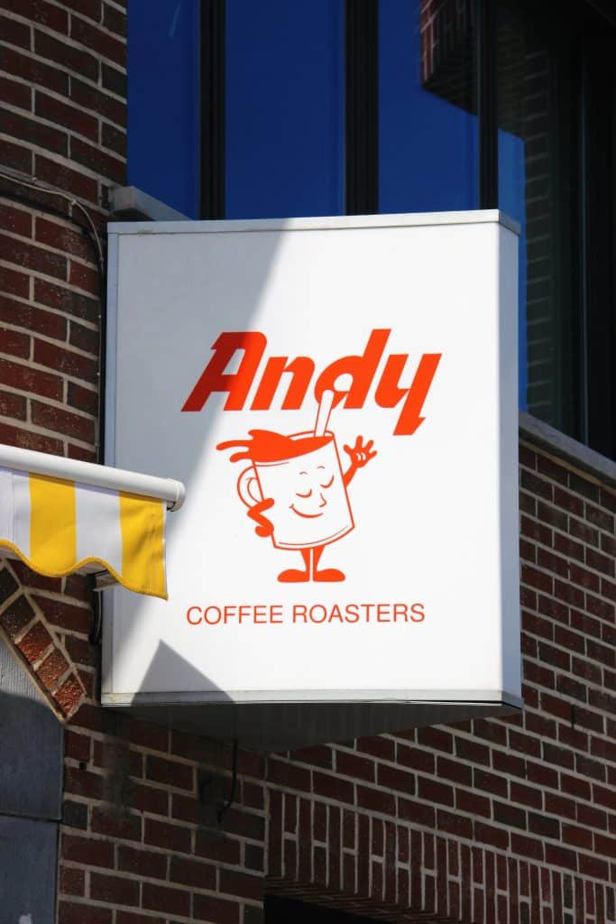
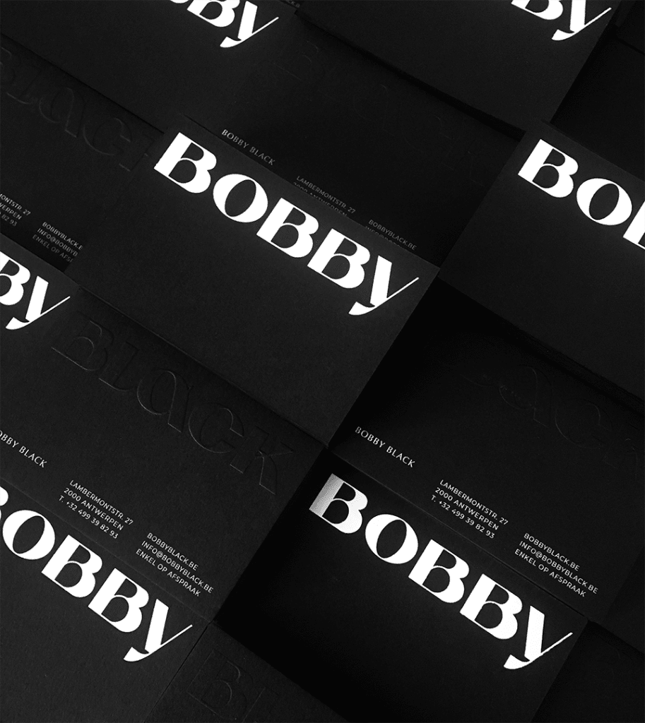
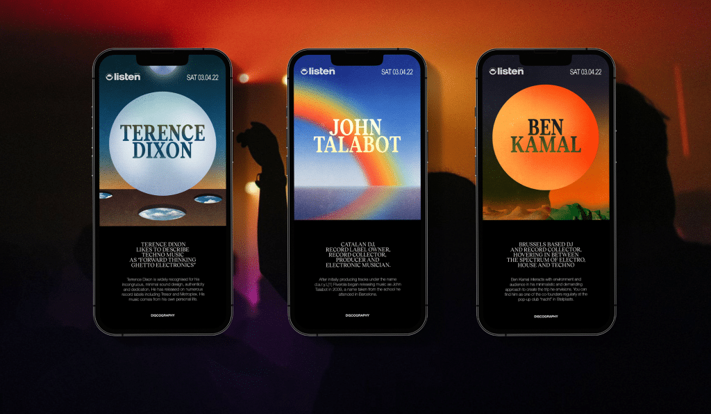
Transcript
Timothy Helmer: [00:00:00] Hi and welcome to Shorts, our short version of Let’s Talk Design, where I, Timothy, interview designers to find out what makes them tick. In this episode, I ask six questions to Tessa and Laurie, who are the founders of design studio Lobster.
How did you get started?
Tessa Persoons: We met in 2015 at Famous, the advertising agency.
Where we worked together as colleagues very closely, and we noticed that we had the same approach to design, the same aesthetic, and the same humor, as well, So it clicked. And we noticed that after working for several years in larger agencies that we missed being on, yeah, the, the, the beginning of the brand story.
So we were always working with brands that already existed. And we really would love to work on the brand itself and also be able to work more closely with the client because in a large [00:01:00] agency, you’re always at the bottom of the process. And we found it important to
be more in contact with the person who actually work there.
Lauwri De Pater: And we really missed contact with clients because you only get to know their story and the feeling behind a brand. When we talk to the, to the
people who who Yeah,
Tessa Persoons: we’re actually behind the business. So this is why we started Lobster in 2017, mostly out of this idea of let’s have fun together and let’s create some nice projects and work more closely with the people behind the brands.
Lauwri De Pater: Yes.
Timothy Helmer: What’s your design philosophy?
Lauwri De Pater: We want to make brandings that are really a reflection of the brand’s story. What’s behind a brand and that are not interchangeable with aesthetics that are trending at the moment or that you see everywhere. We really want to make something that is that reflects the core of the brand that we are working for.
Tessa Persoons: Yes. And that’s why we never make [00:02:00] design choices out of just a mood board. We always start with a research phase and a concept phase. And that’s the core of every branding we create is really to make something that We really dive deep into this strategic and conceptual phase first, and everything we create from there, every color we choose, every font we choose, we always link back to the original concept.
This way, we try to avoid having something that’s just nice looking, but it doesn’t have any, any connection to the brand story, which also makes it more easy to become a branding that can stand. The times . After a few years, a color can become less trending, but if you still have the idea behind it, and if you don’t choose it because it’s on trend, but you treat like a
Lauwri De Pater: you need to design a backbone and this is not only for logo colors, typeface, et cetera, it also serves purpose for art direction, photography total voice in your texts. It’s [00:03:00] really like a, a basis concept that you need to feel throughout the whole brand.
Tessa Persoons: Yeah. It’s really the brand story. That’s so important. And also, there’s another thing apart from it being a branding that really needs to fit the need of the client or the story of the client.
We always like to add our, we like to call it lobster sauce. And it’s something we hope people can also see in our designs is that everything that comes out of this you can recognize that it’s a lobster branding because we try to play with this balance of contrasts and try to make everything look elegant.
But there’s always a little twist, it can be feminine, but a muscular twist, or yeah, it’s tension, trying to create every branding that gets out of the agency that we feel it.
Lauwri De Pater: I think, yeah,
Tessa Persoons: our signature
Lauwri De Pater: tension is, is the, the best word to describe it because it, it, a branding, it needs to be interesting enough. So there needs to be this kind of thing that’s off or you need to feel the [00:04:00] tension.
Tessa Persoons: Yeah, for us, that’s where the magic happens. Like in between, there’s something that’s very appealing, but then there’s something that makes you look twice and makes you feel like, Oh, something’s off.
We believe that that’s interesting as a visual language.
Timothy Helmer: Can you tell us about your typical workflow when approaching a commissioned project?
Tessa Persoons: So the first phase we start off with is very important to us. As we mentioned before close contact with the clients and the, the brand story of the client is very important.
So we like to start with a kickoff meeting, which involves all the people who are Yeah. In connection with the brand to really get to know the brand, ask the right questions,
Lauwri De Pater: do a workshop.
Tessa Persoons: It’s the people that behind it and this is really very important to us because it’s the basis of our concept phase and research phase, which is the backbone of the brand identity.
So this is where we lay out the strategic brand story, but also the visual brand story. It’s a presentation we create with mood boards, but we even make [00:05:00] Photoshops of mood boards sometimes.
Lauwri De Pater: The concept needs to be very clear. And if therefore we need to, to fake our moods or make, make things that are in the same universe that we need to do that because it’s the most important presentation in the process.
Tessa Persoons: We also noticed that because these mood boards are so specific and because we sometimes actually have fake our own moods. The client already really knows what direction it’s taking, and we rarely have a lot of rework in the design phase because everyone already knows a bit what vibe we were going for.
And so it’s less of a surprise and it’s, it’s, it’s less time consuming for us to be discovering this in the design phase.
Lauwri De Pater: It’s also a presentation where you can, get a very good look on what the client likes and dislikes. For certain moods, maybe it says, ah, but this color, I really hate this color.
And it, it, it, it tells you a lot about a client, before you start designing. So all this [00:06:00] information you can take with you in the design process.
Tessa Persoons: Yes. Because the design process is the next phase. And by then we create after approval of the concept phase, we create the logo, the graphic toolbox, the colors.
And you immediately take in some applications into this presentation, such as social templates print work, stationery. And we like to foresee as many client reviews as possible because we believe it’s very important to really work very closely with the client and not wait two months before showing something because the more feedback, the better and the more you can together on the creation of the process.
Timothy Helmer: What is the most difficult part of brand design?
Lauwri De Pater: I think the most difficult part is that you have the feeling that you constantly need to reinvent a brand or reinvent yourself because you’re designing it. And it’s really hard to not fall into these trendy hype [00:07:00] things or Things that you come across or you, you get,
Tessa Persoons: Knowing that now and it’s contemporary, but you don’t want something that’s so trending that in a few, once or in a few years, it will already build date.
Yeah. So this is a constant challenge also. There’s so much out there, there’s so much nice brandings.
Lauwri De Pater: Everything is, has been done.
Tessa Persoons: Mm-hmm. .
Lauwri De Pater: So yeah, I think that’s, that’s a difficult part. But also making a branding that is,
That is fool proof that can be adapted by other people than designers.
Tessa Persoons: So yeah, it’s very easy as a designer to create something that looks nice because you are in charge of every little detail. But of course the moment the branding is finished, not in a lot of cases, we get to have full control on what happens to the branding afterwards. So you have to kind of give it, hand it over to the marketing people, to the in house designer.
And this is. It’s actually also something we need to learn or to,
Lauwri De Pater: there needs to be a set of rules, yeah [00:08:00] very clear not too difficult to, to adapt. Yeah.
Tessa Persoons: So that the branding can maintain its character and doesn’t lose all of its strength when it’s, it’s not designed by a designer, but not every touch point is designed by designers.
So this is something that’s really a challenge often. Yes.
Timothy Helmer: What makes good brand design?
Lauwri De Pater: I think, as we said earlier, that the, the brand story or the backbone needs to be visible in every touch point which means that it’s also visible in photography copywriting every little element and detail of the brand needs to be in line with the story.
Tessa Persoons: For example, sometimes you have a TV spot and you don’t know what brand it’s for, but just by the type of photography or videography, you already recognize that it’s there. So this is something like the, the printing, the typefaces, the colors, yeah, the photography. If something already reveals [00:09:00] what brand it is without even seeing the logo or the context, which means that it recognizably and good branding, which
Lauwri De Pater: shouldn’t be more than picking a typeface, picking a logo and a color.
It’s, it’s more than that. It’s, it’s shaping a story.
Timothy Helmer: How do you think AI will influence brand design?
Tessa Persoons: We believe AI could be very interesting to our work fields. We don’t immediately feel threatened by it. I believe there’s a lot of opportunities and possibilities there. First of all, it can save you time when it’s used as a tool, for example, to create mockups or in brainstorms to visualize ideas.
But on the second hand, it’s, yeah, a role will always be needed, maybe even more so in a world where AI creates a lot of imagery, because there will always be someone needed to curate and to enter the input into the, into the,
Lauwri De Pater: you need to have an idea before you can get it out of AI. So, and your idea needs to be very clear [00:10:00] already, because you need to type in what you want, you need to know what you want.
Tessa Persoons: Yeah. So we believe it can be a very good tool and we are very looking forward to see how it will change our fields. I think it will be more of an asset than a threat to be honest.
Lauwri De Pater: I think so too. I think it’s a tool that we’re going to use more and more of. Yeah.
Tessa Persoons: More, our function will be heading more towards art directors maybe than designers.
When AI will be creating the designs himself. Mm hmm.
Timothy Helmer: Thank you for listening or watching. You can subscribe to the series on YouTube and your favorite podcast app. Feel free to share tips, comments, and feedback on those platforms. Your feedback is essential to improve this series. Let’s talk soon.
