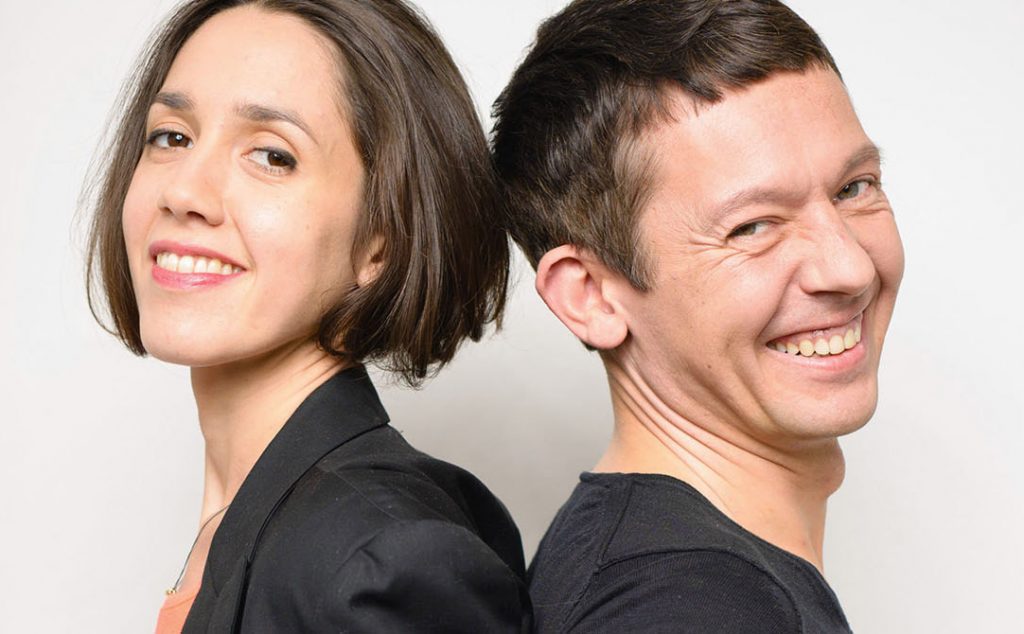
Berlin-based designer Raban Ruddigkeit has been pushing the envelope for over twenty years. With more than a hundred national and international awards on his mantlepiece and an impressive list of clients in his portfolio, you would be forgiven for thinking he might relax and enjoy the view for a while. Instead, he and his creative partner Lea Brousse are ready for a major overhaul of their design atelier. Their focus is now firmly on branding in the digital age.
Raban and Lea, when did you first get involved with graphic design?
Raban Ruddigkeit: My father was a graphic designer and a painter in Leipzig, and my mother was a writer. So I guess that’s how I first got involved with it. But to this day, I don’t really consider myself a graphic designer. I’m more of a transmitter or translator of content if you will.
At different points in my career, I worked in printing, made magazines, wrote texts … For me, it’s not about drawing pretty things or the colour that would best suit your logo. You know, the type of stuff you see on design blogs (laughs). I like to think about societal problems and the solutions to those problems. If you could do away with miscommunication, the world would be a better place.
Lea Brousse: I come from a very academic school, where I studied product design. And I am a lot younger than Raban, but I fully agree with his philosophy. Design should be about making something new or making something better, not just copying what exists. To some extent, graphic design, product design and architecture all serve this same purpose.
On your website, you posted ten guidelines for good branding in a digital world, taking your cue from Dieter Rams’ ten principles of good design. Number five on the list says that good design should be progressive. What does that mean?
RR: At first it said that good design should be neutral, but no one understood what we were talking about. So we changed it to progressive, meaning that it’s not just about having a logo and space around it.
In a digital environment, your logo is surrounded by a good many other visual elements. The classical rules of design simply don’t work in this setting. You don’t have space! There are no ten millimetres to the left and right. That’s old stuff for an old world.
I still see this tendency among my students at AMD Hamburg. They say: ‘when we grow up, we’ll do these nice posters or work for a publishing house’. It’s a romantic notion and completely inadequate! When you step on a train nowadays, you only see people playing with their smartphones. Printed matter is on its way out. Still, every designer has published a book on book design, and if they’re lucky they’ll sell more than one copy of it (laughs).
As designers, we can learn so much from Silicon Valley, where these startups are doing really creative things. So for the last couple of months, we have been on a sort of self-exploration, not bothering too much with clients, but seeking true creative partnerships instead.
LB: Designers still tend to think of the print process. It’s as if we don’t believe a website or an app can be beautiful because it has too many layers. You just have to find a way to simplify your brand, so that it fits in this new environment.
RR: What’s the logo of Twitter? Is it a bird or a T? And does it matter? We are finally at the point where we can embrace this new technology. It’s not automatic by any means. It took us a long time to get used to moving images too.
Next on the list: good design should be sustainable. That’s clear enough for a product designer, but how do you make your brand sustainable?
LB: Sustainable means timeless. Your corporate identity shouldn’t be trendy. It has to withstand trends. This year you see triangles and – what are they called – reindeer everywhere, you can’t escape it. Next year it’s something else. It doesn’t have any meaning, so it’s useless, it’s trash.
RR: A great example is the cantilever chair that was created by the Bauhaus designers in the twenties. More than eighty years later, this same model is still being sold. Why shouldn’t we aspire to that kind of longevity when it comes to graphic design? Sustainability isn’t necessarily about using less paper. It’s about being economical, even in design.
You also believe that design needs to be open. Designers and clients should be able to let go of the brand they created. That almost sounds like a Buddhist mantra.
RR: Every designer knows that style guides can be ridiculously oversized. In a lot of cases, there are far too many rules for designers. We are creators! How can you work with this document that kills all creativity?
I’ve worked with small companies that could not afford to pay for my services from brand conception to finalization. So I set out some simple guidelines and let other designers or even employees of these companies complete the process. The same goes for the consumers. They too can be part of the brand, and the brand can become part of their lives.
LB: Basically, as a brand, you’re trying to have a conversation with the world. But what kind of conversation can you have when you’ve already decided on everything?
It’s obvious you’re not keen on looking back, but is there any work you’re particularly proud of?
LB: I always feel like I can do better. Obviously, we like it when people are satisfied. A client once said that working with us was like meditating and we felt pretty good about that (laughs). But in the end, the pleasure is in the process.
RR: I agree. And hopefully, we can also have more fun with our smartphones afterwards (laughs).

