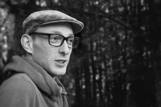
I grew up in Houthalen, Limburg. Like many kids at the age of 6, I attended an after-school art program. It was the embodiment of creating, the right mixture of goofing around and being inspired.
At the age of 16, there was already so much love and interest for design that I decided to go start studying ‘multimedia technieken’ (multimedia techniques). It was the first time I got to work with those colourful iMacs. Colour theory and typography brought out the nerd in me, and we witnessed first hand how InDesign was taking over QuarkXpress as a layout tool.
After graduating high school, I studied ‘communication, multimedia & design’ in Genk, my study there was an absolute disaster. The spectrum of the course was too broad, it didn’t feel right. I ended up making the switch to studying graphic design at The Royal Academy of Fine Arts (KASK) in Ghent, I never graduated but I did meet the love of my life over there. Afterwards, I did a few payroll jobs which confirmed my idea: I would use practice as an education instead of going school. After living in Ghent for 10 years I currently live and work in a quiet green environment: Ronse, a small city in Belgium.
When did you first get involved with design?
When I had my first computer and found out there where other drawing programs besides MS Paint, in other words, when using layers became an option in design software. Remember that grunge style, layered over photo’s, with high contrast. So hot back then… I know.
Is there any work you’re particularly proud of?
That must be the main illustration for the campaign of ‘Gentse Feesten 2016’ (a huge city festival). Having lived there for so long, I was quite honoured to contribute to this city I hold so dear. Besides that it was a dream job; the brief was right up my alley: transform the core features of the city into pinball attributes while maintaining a warm, playful yet realistic visual.
My very first assignment as an employee was creating the ‘Zinetta’ magazine for the company ‘Modular Lighting’. With no prior design experience in that field, an insane workload and a very tight deadline. A tough nut to crack.
In your view, what were your biggest challenges?
It’s always the financial and commercial side of freelancing, isn’t it? Prospecting isn’t one of my strong suits. Fortunately, I have an amazing wife who has those skill sets and pushes me to do so. I also have a tendency to lose myself in details. Tight deadlines make it so much easier for me.
What inspires you?
There’s an overwhelming amount of inspiration out there. It’s a funny thing, inspiration can pop up in the most diverse ways. For example, the countdown machine “Happy 2015” was inspired by the flipping clock from the movie Groundhog Day.
I can also find inspiration in interiors, (analogue) typography, electronics (and technology as a whole), space and Pixar movies. I try to stay away from obvious CGI looking imagery. (3D) Trends is something I keep up with, but I hardly ever incorporate that in my work.
And of course: nature. It has so many intricate beauty. Most of it is so hard to reproduce in 3D, nature, on the other hand, makes it look easy.

